Design exploration: Todoist
I’m looking to develop my understanding and skills in web design. So I looked a bit closer at an app I use every day: Todoist. This is really an exercise in developing my eye and learning to see. I didn’t have any criteria in mind. These are just some of the things I noticed when I had a spare half hour.
Obscure menu
On the reporting page, there’s a list of filters under the page’s heading. There is also a choice of 5 “presets” hidden away in this menu. You have to click on the heading - or adjacent carret icon button - to find it.
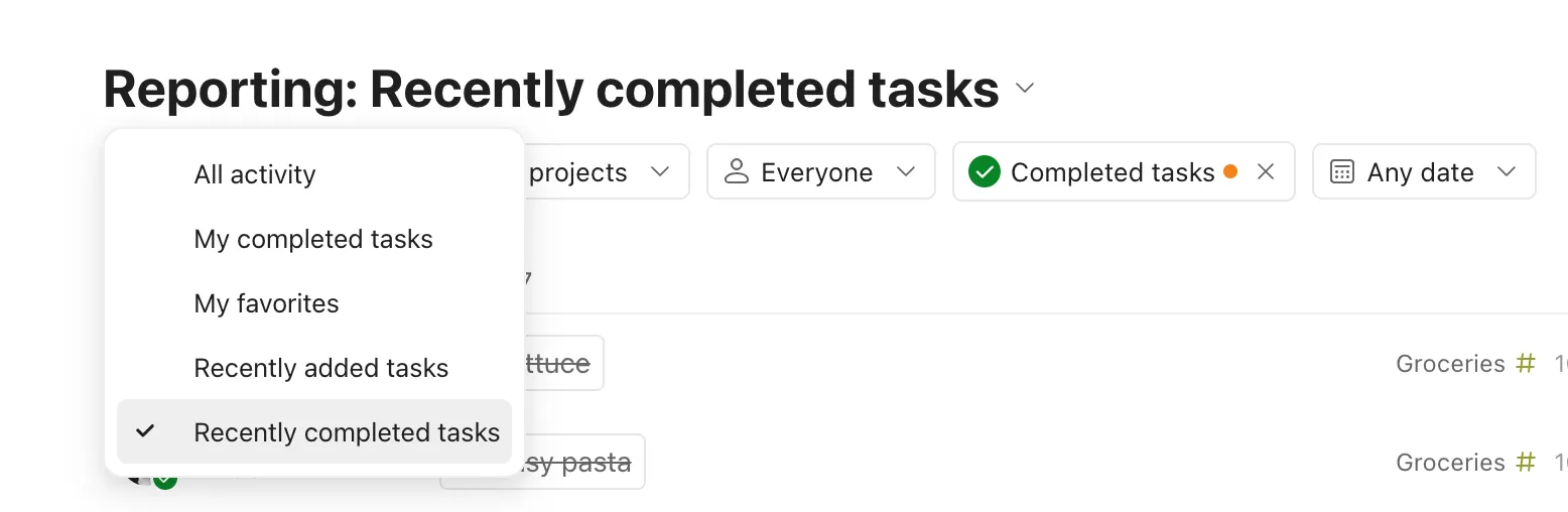
I don’t use the reporting page so it’s meaningless to say that I’ve never seen this before, but I think I would never have found it if I weren’t looking intentionally. I’m also not sure what it’s for. “All activity” effectively means “no filters”, in which case a “clear filters” button would work.
“My completed tasks”, “Recently completed tasks” and “Recently added tasks” would be well served by a combination of filtering and ordering: “completed tasks” or “added tasks” + order by most recent.
I think that just leaves “My favorites” as a special case that is not served by the other filters. Which it could be, I think